Let the color serve the piece
Gold color is a design choice shaped by the wearer, the stone, the finish, and the setting.
Compare the same design in each direction so the color supports the stone, skin tone, wardrobe, and feeling you want—without assuming one shade works for everyone.
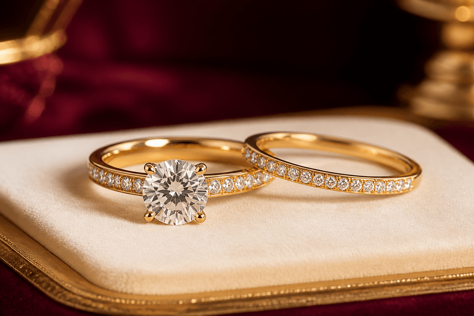
Fit, wear & care—considered together
A clearer decision, with the important context kept beside it
Yellow, white, and rose gold are color directions, not rules about who should wear them. Compare the same design under the same light, then review karat, alloy, finish, and mixed-metal ideas.
Use this page when
- You want to see one stone or design in several gold colors.
- You are matching a wardrobe, existing jewelry, wedding set, or meaningful color preference.
Pause and choose another path when
- You want skin tone, gender, or fashion rules to dictate one correct answer.
- You assume every alloy within one color has the same exact shade or wear behavior.
Where this choice often matters
- Comparing engagement-ring and wedding-band color harmony.
- Choosing a two-tone anniversary, birthday, or self-gift piece.
Compare the details
Compare color on the same design
For a fair color comparison, keep the design, stone, lighting, and camera treatment consistent while changing only the gold direction.
| Direction | Visual question | Specification question | Useful next view |
|---|---|---|---|
| Yellow gold | How warm should it feel? | Karat, alloy, finish | Same stone in neutral light |
| White gold | Bright, soft, or matched white? | Karat, alloy, plating/finish | Beside existing white metal |
| Rose gold | How pink or subtle? | Karat, alloy, finish | Same design beside yellow gold |
| Two-tone | Where should each color appear? | Primary/secondary metal and joints | Front, side, and worn view |
Keep your direction organised
The complete choice groups for this decision
Yellow, white, and rose gold are color directions, not rules about who should wear them. Compare the same design under the same light, then review karat, alloy, finish, and mixed-metal ideas. The groups below keep related choices together, and every selection stays editable when you continue.
Which color directions should we keep?
Keep every direction that fits.
- Yellow goldWarm gold direction.
- White goldConfirm alloy and finish.
- Rose goldConfirm exact tone direction.
- Two-toneName each location.
Where should you compare them?
Keep every direction that fits.
- Around the chosen stoneKeep the stone and lighting fixed.
- Beside existing jewelryUse a private permitted reference.
- As a matching setReview adjoining pieces together.
- In a try-on visualizationTreat it as a visualization, not an exact color guarantee.
Questions worth asking
Open the concern that sounds like yours
Choose the question that sounds like yours. Each answer keeps the next step clear without closing decisions that still need review.
Which gold color is best for my skin tone?
There is no required match. Compare colors you enjoy under neutral light and beside jewelry you already wear.
Can I mix metal colors in one piece?
Yes, when the construction supports it. Mark the primary and secondary locations clearly.
Will rose gold always look the same?
No. Shade can vary with karat, alloy, finish, lighting, and surrounding materials.
Ready when you are
Carry this direction into your design
Leyloon can keep these choices together while you continue. Every detail stays editable. Your choices stay editable as you continue.
- Primary gold colorNeeded before the direction is complete
- Secondary color and locationA useful next question
- Finish directionKeep it open if you are still deciding
- Optional permitted existing-piece referenceKeep it open if you are still deciding
- Karat direction and comparison contextKeep it open if you are still deciding
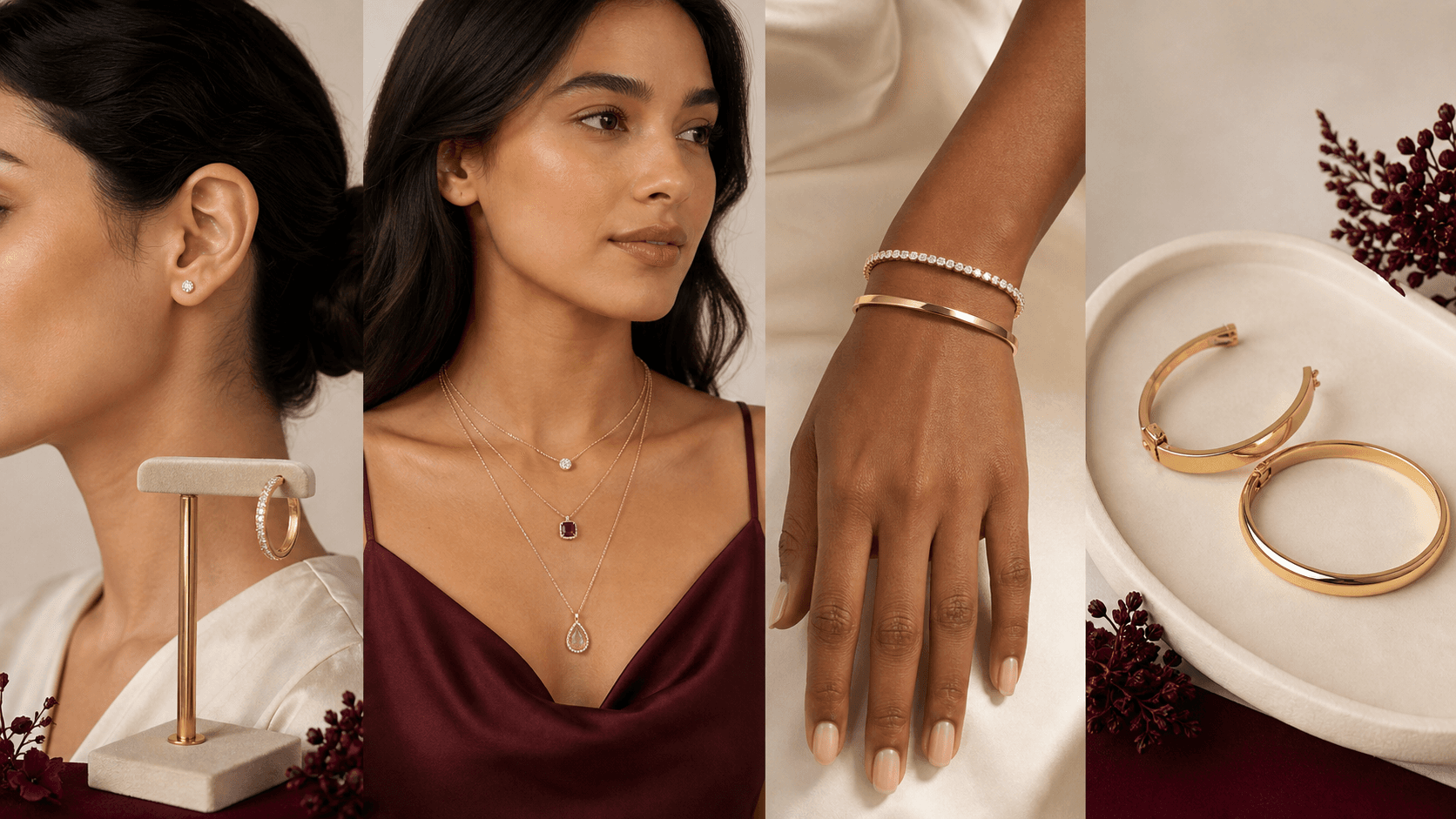
A visual map of this brief
See what stays known—and what remains open
This guide begins with “Choose gold color by the feeling it gives the whole piece.” The next choices stay grouped, editable, and connected to that same Atelier brief.
- Piece to designChoose one piece. The following questions adapt inside Atelier.
- Gold colorCompare the same design in the colors you enjoy. Exact alloy and finish still need review.
- Gold karat directionKarat is one part of the alloy decision. Keep the exact specification and quote open for review.
- Surface finishChoose how you want the surface to catch light. Wear and maintenance depend on the exact piece.
Start with what matters on this page
Choose the piece, then compare gold color on the same design
Start with what you are making. Keep its stone and proportions steady while you compare yellow, white, rose, or two-tone directions.Published customer proof
Real experiences, kept separate from promises
Only approved purchase-linked reviews appear here. An illustrative scene is never presented as a customer, and one person’s experience is never treated as a promise for another piece.See what Leyloon customers have shared
Read recent shop reviews on Etsy, then come back when you are ready to shape your own custom jewelry direction.
These reviews reflect individual Leyloon service experiences. Your custom jewelry direction and quote request are reviewed on their own.